![]()
Table of Contents
Overview
Johnslists list is a website utilizing semantic ui, react.js, meteor, and mongoDB to create a website that can be used by undergraduate and graduate students to trade common goods. Community members of UH Manoa can add common goods, such as textbooks or appliances, that they no longer need and create listings with details about said item.
For more information on the techstack used:
- Meteor for Javascript-based implementation of client and server code.
- React for component-based UI implementation and routing.
- Semantic UI React CSS Framework for UI design.
- MongoDB Backend Database for adding objects
Links
Refer to this section for the various links associated with Johnsonslist.
- Organization Page Johnsonslist’s organization page
- Project Page Johnsonslist’s application website
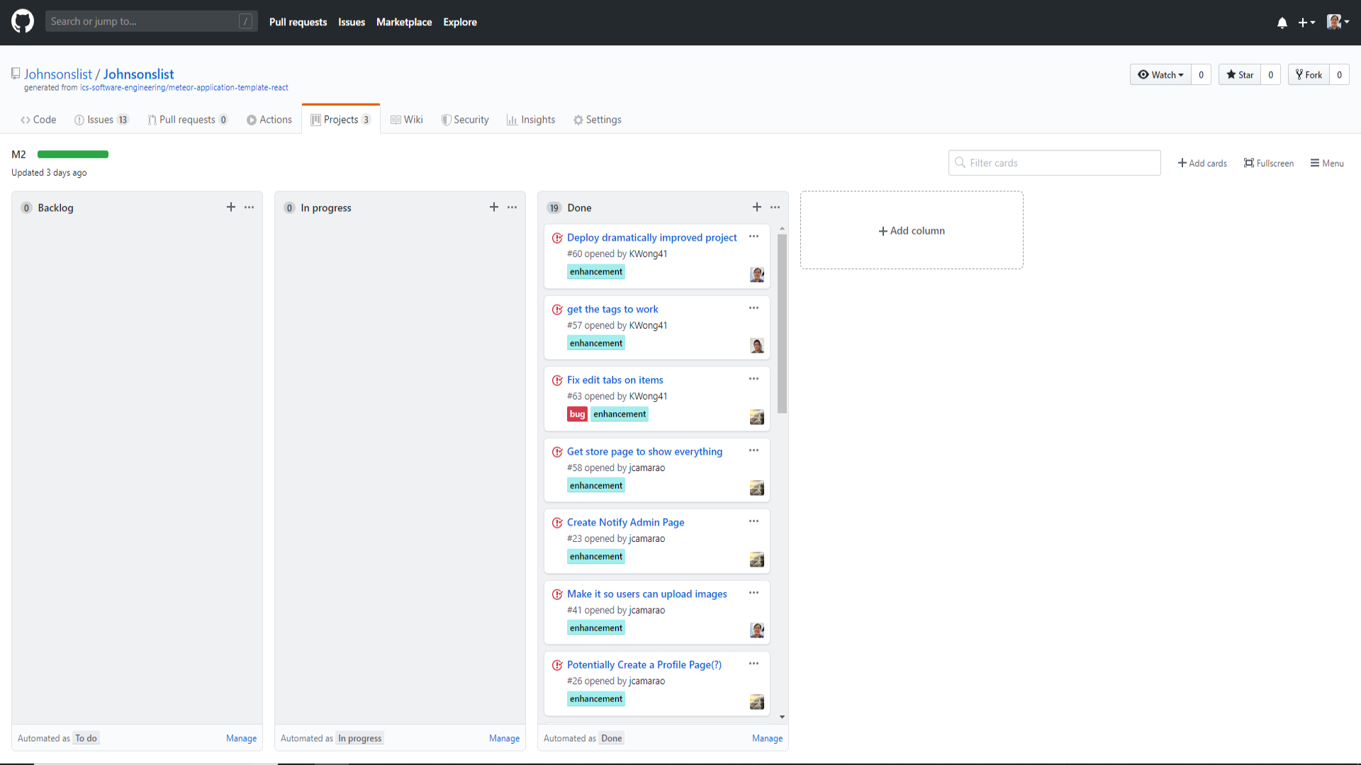
- Milestone 1 Board Issues/Goals for milestone 1 of JohnsonsList
- Milestone 2 Board Issues/Goals for milestone 2 of JohnsonsList
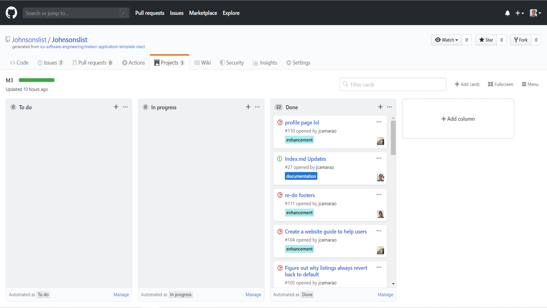
- Milestone 3 Board Issues/Goals for milestone 3 of JohnsonsList
Functionality Goals
- Two types of users: Regular and Administrator (Both of which log in from the same page, but get directed to different home screens and contrasting functionality)
- Profiles can be customized to display a picture and a description of the person
- Add listing, edit listing, and view listings usability features (Regular users can only add/edit their own while admins can have functionality for all listings)
- Listings can be filtered depending on what specifically the user is looking for (Ex. textbooks specifically for biology)
- Users can flag or report listings that are not related to what the site’s purpose is for to admins.
User Guide
Johnsonslist will feature a selection of pages for the user to browse. There will be a screenshot of each page below with a description of usability. For now, it displays rough mockups of what each page may or may not look like in its finalized version.
Landing page
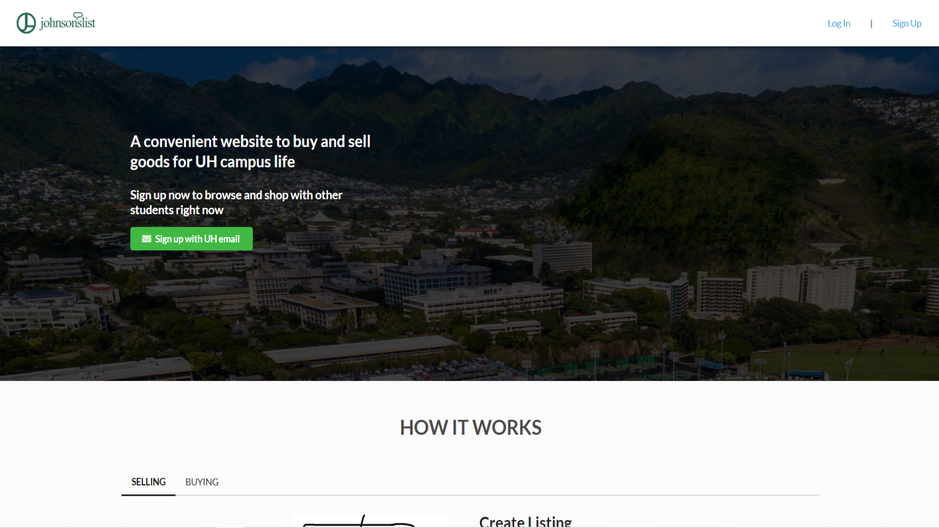
This is the landing page. This is what a new visitor first sees when they visit the site. They have the ability to see the layout of the page with the topbar and the footer, but not the shop options. They are required to log in to have those features for now.
Home page
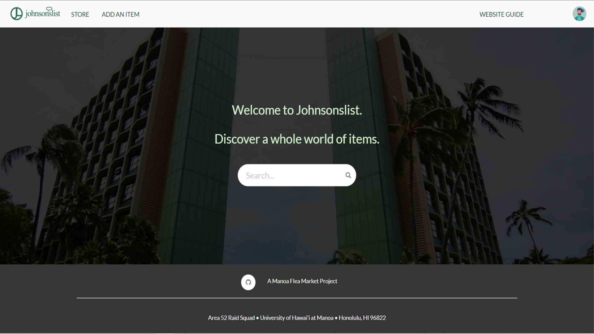
This is the home page that the users see when they log in to the site. They now have the “store”, “add an item”, and “website” options in the navbar below the top bar. When a user logs onto the site, you will see a search bar that pops up in the middle of the website that helps you to navigate to what the user might want to buy.
Website Guide
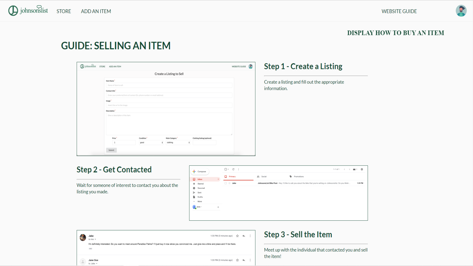
This is the website guide in JohnsonsList. This page gives you a step-by-step instructional walkthrough on what to do while buying and selling an item. This is where most users should start at if you are lost at where to go as far as buying and selling an item on this website.
Store/Shopping page
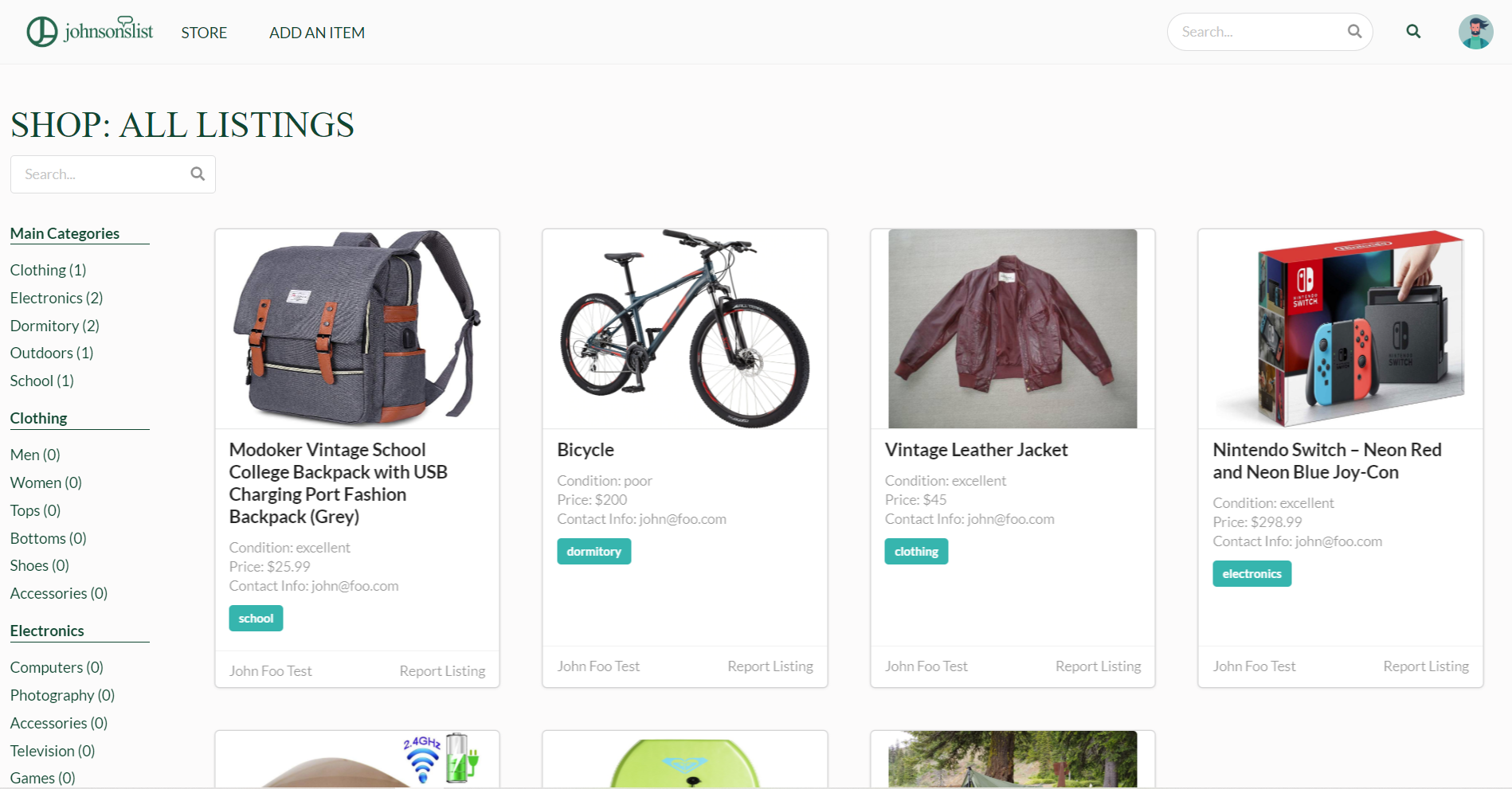
The store page is the centralized location of the store where users can look at and filter through categories of items that they wish to specifically look at. There is a sidebar on the left-hand side that filters specific types of items for ease of use viewing that can cater to the user’s interest.
Selling an item
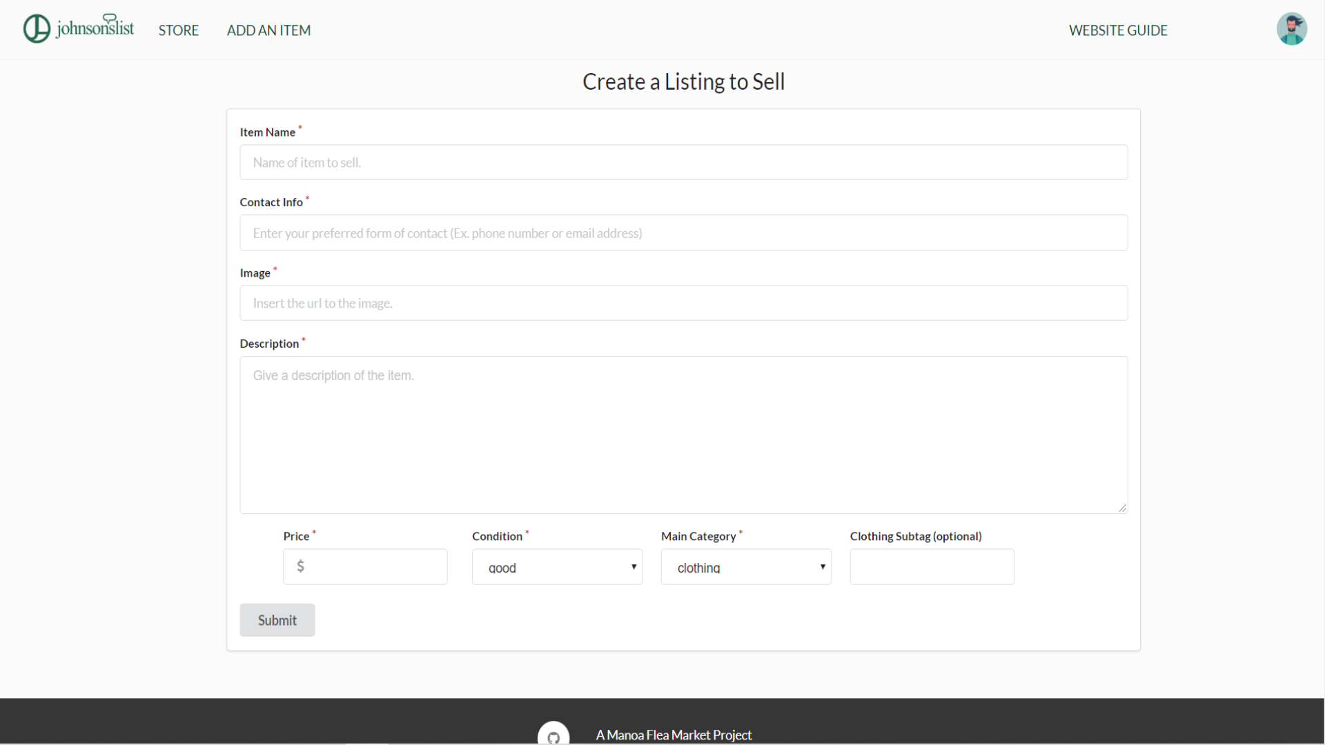
This is what the page of selling an item looks like. It is complete with the following tabs: Name, Contact Information, Image (HTML links only no uploads), Description, Price, Condition, and Categories. Each tab that is listed is a required tab in order to post an item to be sold on the website. Note: an item that is being posted in a specific category will go to that tab alongside the website. For example, if you are planning on selling an electronic device, you would post it under the category “Electronics”. This item would automatically pop-up as an item under the “Electronics” tab on the top navigation bar.
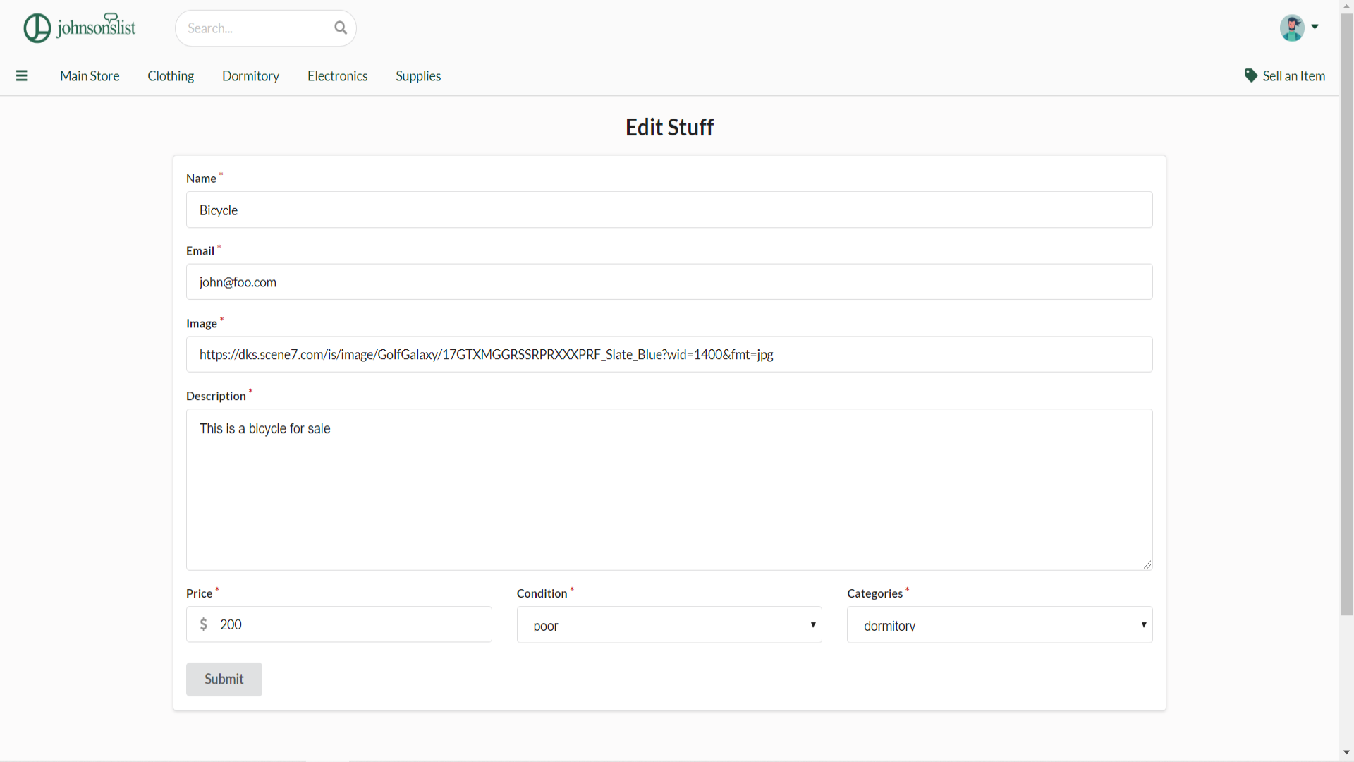
While selling an item, users will also be able to edit their own items. They can change their own characteristics and distinctions of their item so that each item being sold will look unique in the shopping page.
Developer Guide (Windows/Mac)
To intially run the application, install Meteor.
$ meteor npm install
Next, go to this link and clone this project to your local computer. You can either download a zip file version of this project or run it through the commandline using the following commands:
cd (in your local directory of where you stored this project)
then run this command:
cd app
From there, run the following command to start up the application:
$ meteor npm run start
If done correctly, the application will appear at http://localhost:3000.
Milestone 1
The goal for Milestone 1 was to implement a somewhat working web application using ReactJS, Meteor, MongoDB, and Semantic UI. We started off by creating “rough-draft” templates of the project website. By creating these rough-drafts, we began to cut into our creativity and functionality by asking ourselves various innovative and unique questions. For example, what would the site cater to in the grand-scheme of things? What would it look like? What is the target audience for this website? and so on. Please click here for more information about Milestone 1.
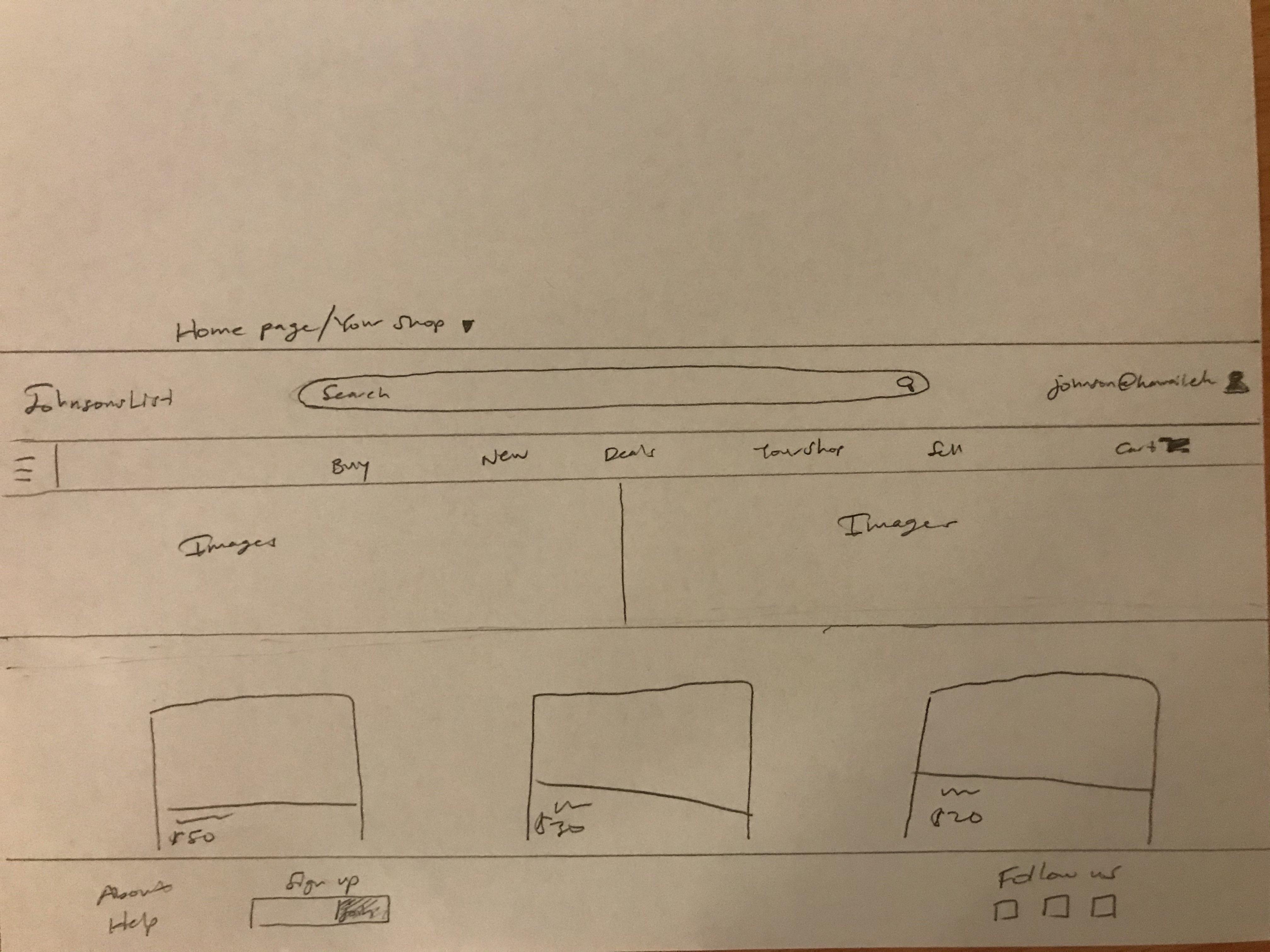
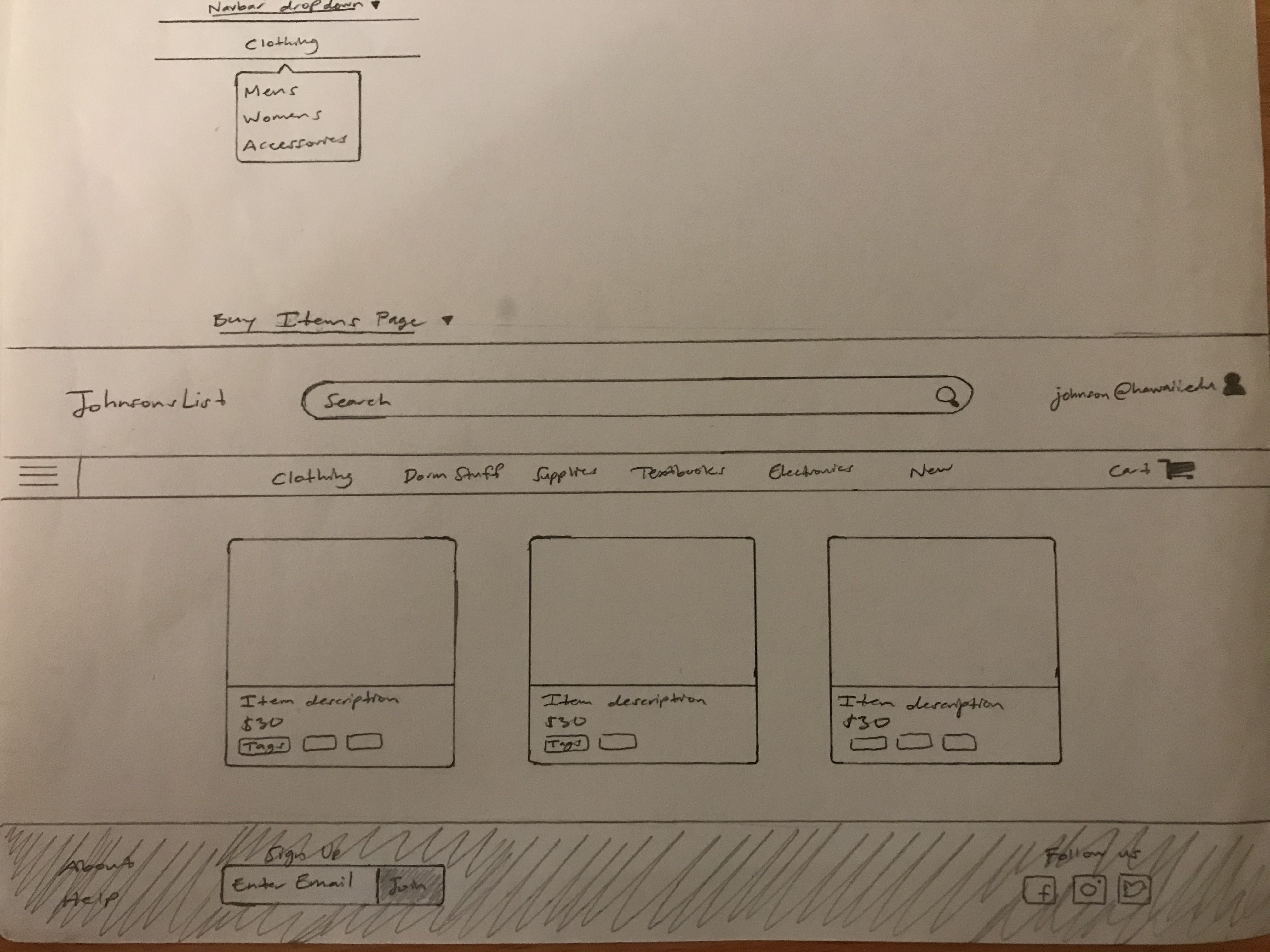
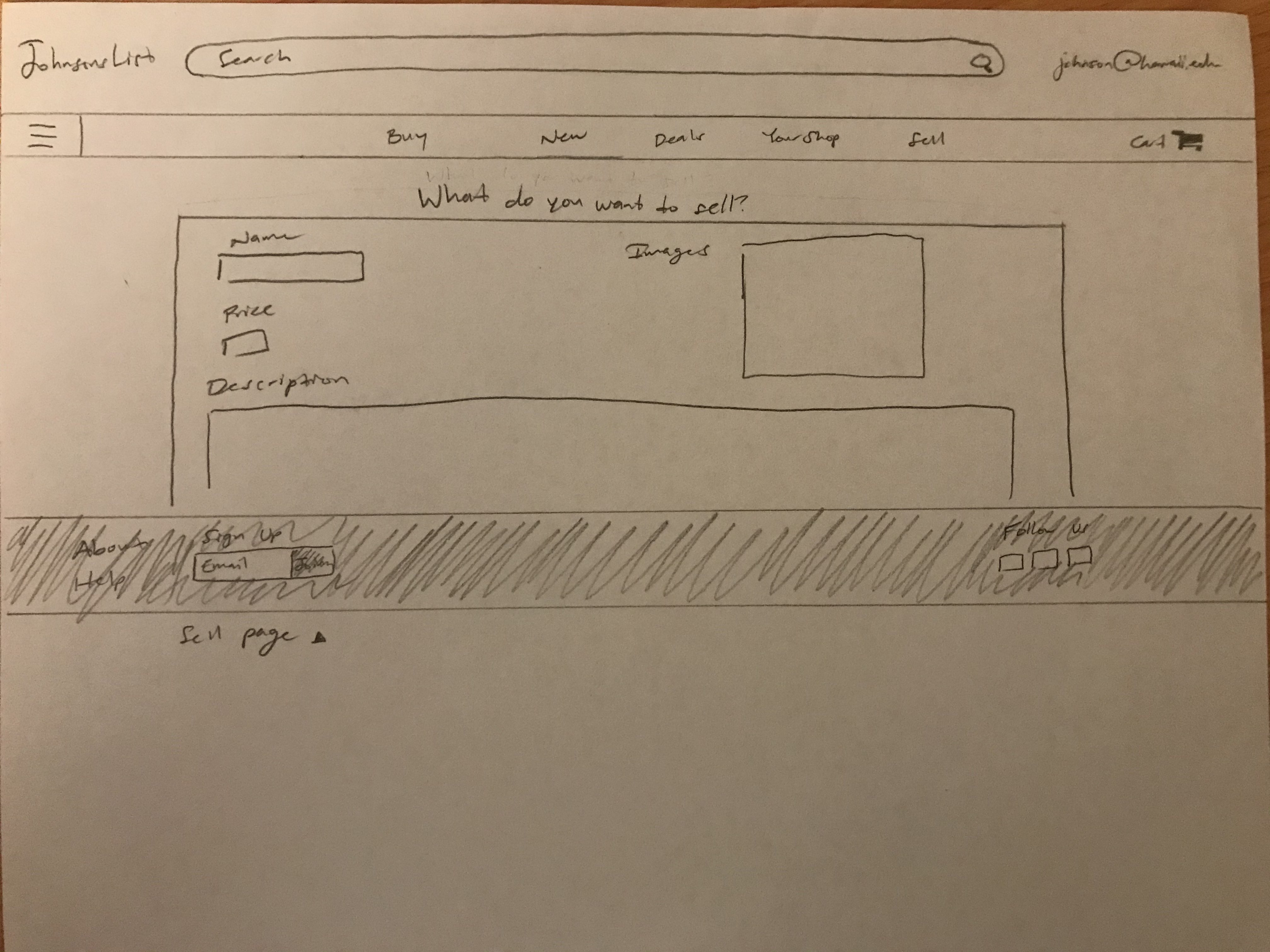
Here are some “behind-the-scenes” drawings that we used as mock-up drafts in the creation of our web application.
Mock-up Home Page
Mock-up Shopping Page
Mock-up Selling an item Page
Milestone 2
The goal for milestone 2 was to use this somewhat-working web application and increase it’s functionality. In doing so, we met several times in a group meeting and asked ourselves, “how could we increase the user experience, navigation and overall attraction of the website?”. We thought out multiple ideas that catered towards the user-friendly experience by increasing the difficulty of these milestone issues and then executing accordingly to each respective issue. If any one of us needed help in an issue, we were there to back them up and possibly recreate that issue and break it down into smaller parts to solve algorithmically. Please click here for more information about Milestone 2.
Milestone 3
Finally, milestone 3 complimented milestone 2 by further refining and increasing the user functionality of this web app. This means we as a whole took our ideas from milestone 2 and refined them. Some ideas that we had in Milestone 2, we used a dynamic programming approach by minimizing clutter alongside the navigation bar. Initially, our navbar had multiple tabs that were created to filter out different types of items that is being viewed on the store. By creating a left side-bar, we could add as many filters as we wanted to without making the website look too cluttered and confusing for the everyday user. Metaphorically speaking, it is like a blacksmith sharpening or reforging a sword so that the sword will look good, feel good, and can slice through anything you swing the sword at. Please click here for more information about Milestone 3.
What makes this project stand out from others (what is our special sauce)?
We believe that our project has plenty of user-friendly functionality to go with our project. However, we spent the most time trying to refine this project by creating an application that would look eye-appealing both to the user and the administrators that use it. We put alot of throught into the graphics design of this website as well as the Johnsonslist logos, team logos, and multiple other exciting web pages and we wanted to celebrate that by showing it off in this project. We believe that this sales website has what it takes to compete against other buy and sell websites. To summarize, with the combination of user-friendliness and graphics design, we believe that this web application stands out amongst some of the best sites out there.
Meet the team!

Front-End/Back-End Development/JohnsonsList Github.io page: Jake Camarao
Front-End/Back-End Development: Kason Shiroma
Back-End Production/Development/JohnsonsList Github.io page: Kevin Wong
Community Feedback
-
Love the idea! I think it does need a bit of development though. I think a site like this is definitely useful for UH students. If it catches on, I really think it has potential to grow.
-
Clean UI
-
I like the color scheme and it was easy and fast for me to list my item.
-
Very visually nice. Easy to navigate. Looks professional.
-
I like that you can browse through items by category or search for a specific item using the search bar. Also, I like that you are able to contact the admin to let them know if there’s an issue with something. Overall, the design is minimalistic and functional. I especially like the look of the landing page–it looks very professional.
-
The mobile interface definitely needs work: the images are skewed, and the text fields are sized in such a way that they’re difficult to read or enter text into (during the sign-up process). The desktop version looks great though. It’s clean and simple, as a site should be.
-
categorized well
-
search bar is a little limited: can only search for item name and nothing else.
Feedback
If you have any questions or concerns please feel free to contact us with this feedback page!